Positive Innovation
Worldwide, we support organisations in their transformation, from strategy to implementation.

Positive Innovation
Worldwide, we support organisations in their transformation, from strategy to implementation.
Supporting you across all your challenges


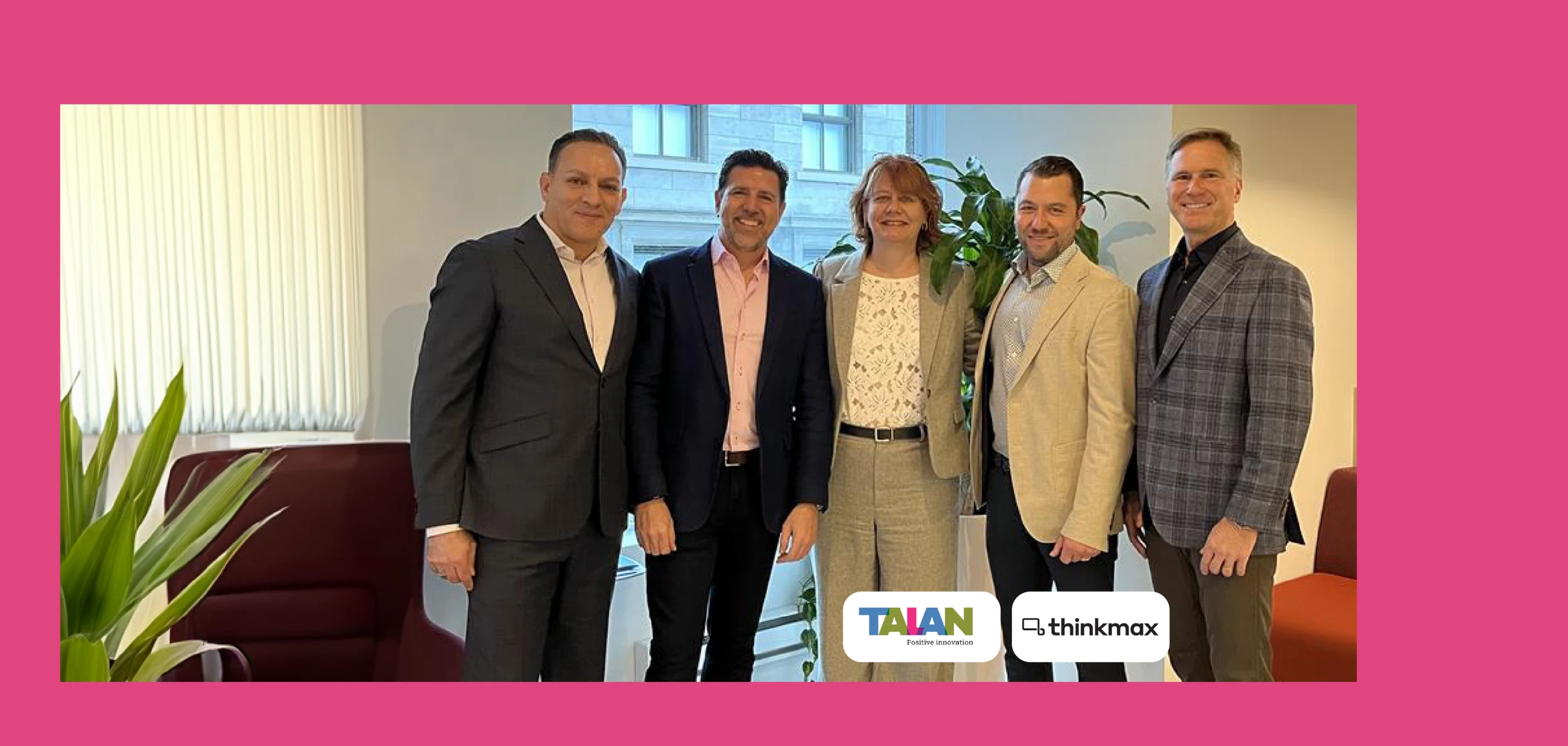
Talan acquires Thinkmax Consulting Inc. to expand its presence in North America and strengthen its position as a Microsoft Dynamics 365 partner and integrator.

Years of experience
Our goal: help you achieve concrete results that accelerate your company's growth.

Experts
Our team of business and technology experts offers pragmatic, sustainable solutions for companies facing productivity challenges.

Projects
Talan guides your digital transformation by optimizing your current processes and integrating new technologies


Talan recruits
We are seeking a talented Software Engineer to join our team and work on Foreign Exchange (FX) desk projects.